

RESULTS
+0%
organic views
0%
new followers since opening
10,500+
interactions
Featured in Elle Québec, Cime FM, & more!
SOLD OUT
Merch sold out before the studio completed its first season
SOLD OUT
Merch sold out before the studio completed its first season
10,500+
interactions
3K+
new followers since opening
819K+
organic views
ART DIRECTION
SOCIAL MEDIA STRATEGY
RESULTS
PRODUCTION
SOCIAL MEDIA MANAGEMENT
STYLING
COPYWRITING
GRAPHIC DESIGN
UGC CONTENT CREATION
CONTENT STRATEGY
CONTENT STRATEGY
REPORTING + ANALYTICS
Featured in Elle Québec, Cime FM,
& more!

Industry: Fitness & Wellness
BUILDING THE BRAND
THAT PUT PILAB ON THE MAP
How We Did It
Brand Identity
We built the full brand from scratch. Logo, monogram, colour palette, typography, tone of voice in both French and English, and complete brand guidelines. We went for something dark, musky, rooted in nature, performance-driven, and with a unisex look. The result was a brand that looked like nothing else in the wellness space.
Campaign Shoot
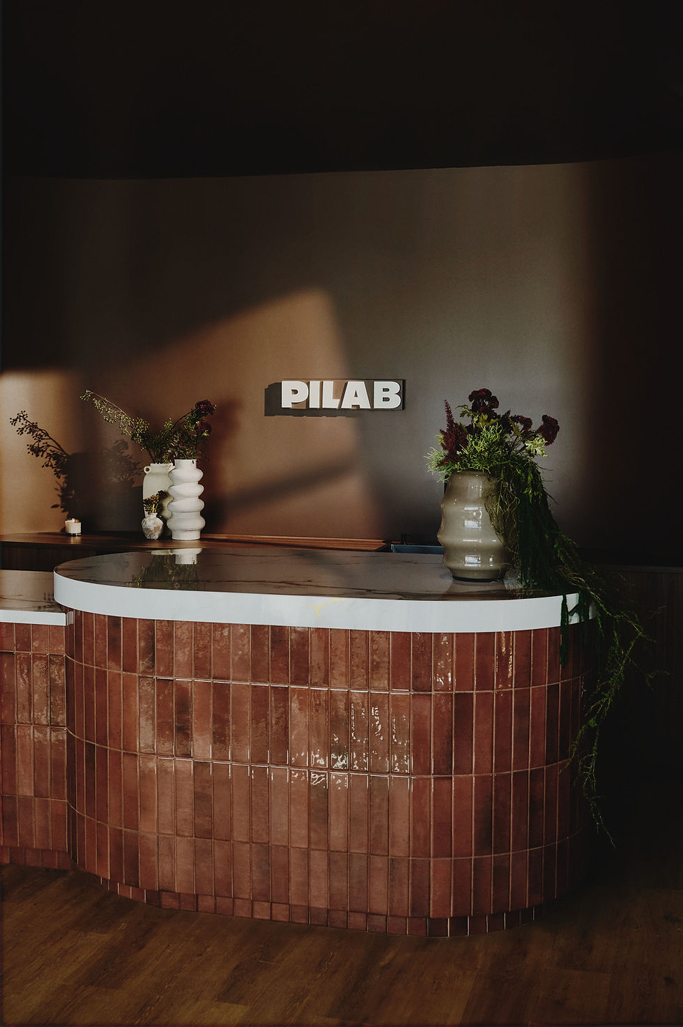
We handled the full production of the launch shoot. Casting, styling, creative direction, and shot list, all built around the brand world we created. Imagery that shows movement, texture, and the interior of the studio itself. Dark, sensorial, and almost tactile. The kind of content that makes people want to be there. The merch sold out before the studio had been open a season. That wasn't luck.

BUILDING THE BRAND
THAT PUT PILAB ON THE MAP
Industry: Fitness & Wellness

PILAB is a pilates studio with a clear vision to grow into a multi-location brand. The wellness pilates space is one of the most oversaturated visual markets out there, everything looks the same, beige, soft, and forgettable.
They hired us to build the full brand identity from scratch and direct all visual assets for launch.


PILAB is a pilates studio with a clear vision to grow into a multi-location brand. The wellness pilates space is one of the most oversaturated visual markets out there, everything looks the same, beige, soft, and forgettable.
They hired us to build the full brand identity from scratch and direct all visual assets for launch.


TESTIMONIAL

We handled the full production of the launch shoot. Casting, styling, creative direction, and shot list, all built around the brand world we created. Imagery that shows movement, texture, and the interior of the studio itself. Dark, sensorial, and almost tactile. The kind of content that makes people want to be there. The merch sold out before the studio had been open a season. That wasn't luck.
Campaign Shoot
Brand Identity
We built the full brand from scratch. Logo, monogram, colour palette, typography, tone of voice in both French and English, and complete brand guidelines. We went for something dark, musky, rooted in nature, performance-driven, and with a unisex look. The result was a brand that looked like nothing else in the wellness space.
TESTIMONIAL


